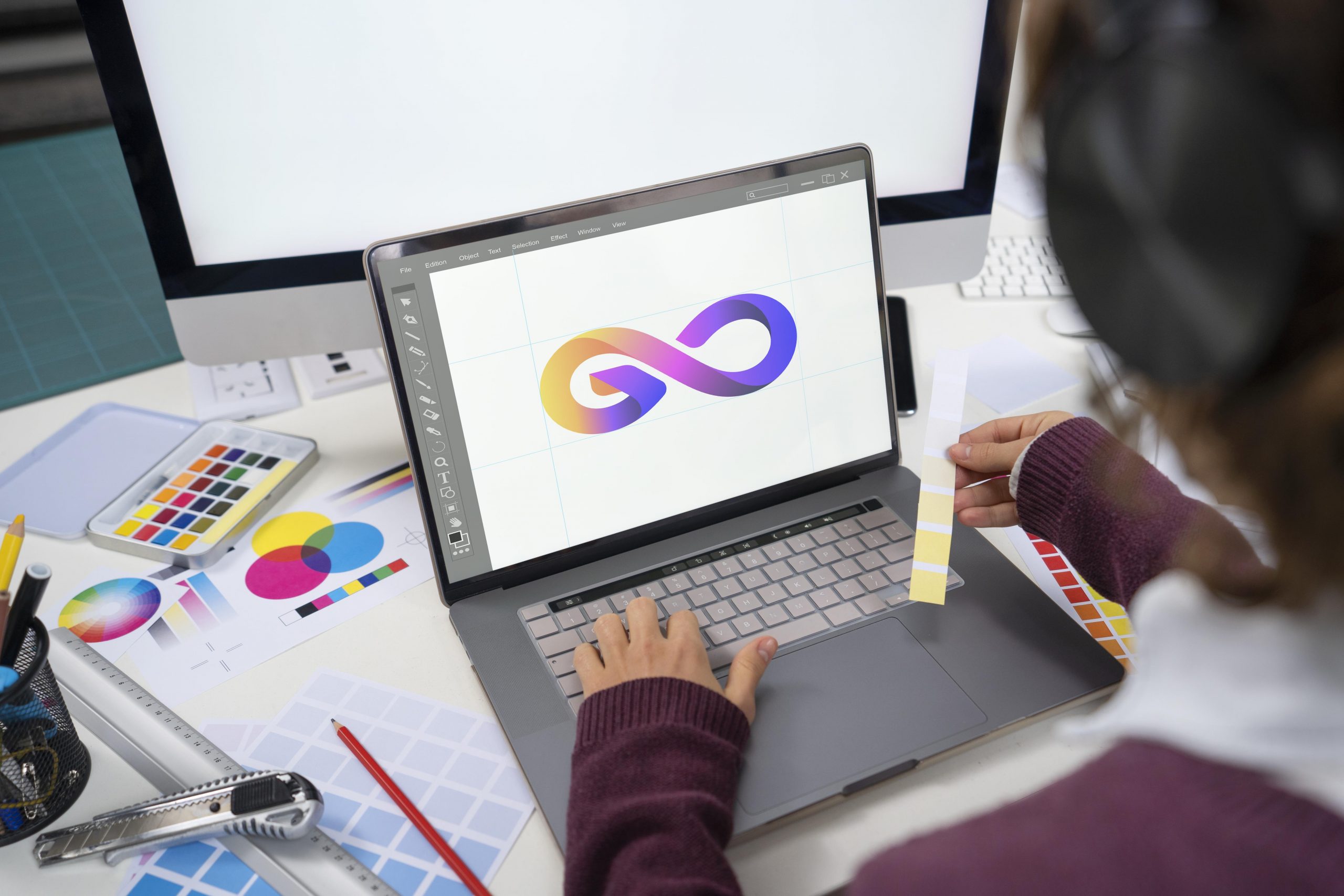
Logo Design & Branding Services in the USA – Recognizing Bad Logo Designs and Avoiding It
What is the best way to get a good logo design? Or, if we put it in a better way, what are the best ways to avoid a bad logo design? This might seem like an oversimplification, but there is a lot of truth in it. Professional logo design and branding services in the USA include the best designers who are aware of the most common mistakes that can happen when designing a logo. This is mostly because they have made those mistakes themselves when designing a logo. In this blog, we will share the details of what to avoid while creating a logo for a brand.
-
Outdated Logos
According to professional logo design and branding services in the USA, a common problem with bad logo design is the use of outdated techniques and visuals. Back in the 1980s and 90s, the effects like 3D gradients, clip art, and certain fonts were used excessively. These days, logos with such elements look dated. If you are dealing with an outdated logo, the best solution is to get a redesign. Yes, of course, the retro design is trending. But if you want a logo with a retro vibe, you should do it purposefully. Use the vintage design elements that are in style currently.
-
Too Many Details
Detailing in a logo design is not bad, but they are not scalable. If you are working with a large billboard, vehicle wrap, or mural, a detailed logo might work well. If you want the logo displayed only in those places, it is better to go for the detailed logos. However, think about how often your logo will appear on smaller surfaces. There is no need to abandon a detailed logo. According to the best logo design and branding services in the USA, the better option is to create a responsive logo where the logo will be available in smaller sizes and other variations.
-
Irrelevant Imagination
What this means is the logos are good, but they are matched badly. This doesn’t necessarily mean a bad logo design. The mismatch is just bad for a specific brand. They look great, but they don’t depict their brands. Thus, they can be confused with other companies in other industries. The logo should represent your brand. Therefore, stick to the imagery directly connected to the company, reflecting its name or what it does. The trick is to be creative. You can still use familiar and iconic imagery without creating generic logos.
-
Vague
According to the best logo design and branding services in the USA, if the logo looks good but doesn’t say anything about the brand, it is still a bad logo design. One of the goals of logos is to explain what your brand is all about, even if it is the first time someone sees your logo. This is not easy because vague logo designs will not offer any information at all. The best solution to it is to add a simple description. Make sure to keep the text minimal. With logos, less text is more, but you can add a few words to explain the features of the brand.
-
Conflicting Themes
Logos can help in setting up the mood for the brand. The trouble is, when themes are mismatched, you are building the wrong feeling for your brand. The imagery and artistic style should echo the brand goals. Using universally recognized icons and the preferred theme of the clientele is a shortcut to effective communication.
-
Generic Logos
Logos are most effective when they are memorable. Generic logos featuring the same trends and styles as other logos have the opposite effect. If you do what everyone else is doing, there is high chance that people will confuse your brand with another one. The thinking behind generic logos is logical; however, after a few years or months, the market becomes flooded with logos that are all doing the same thing. According to the best logo design and branding services in the USA, the best way to prevent this is to stop what everyone else is doing. Generic logos start as good logos. You must make sure to add something that stands out.
-
Confusing
Visually pleasing logos can still miss their mark because of the confusing and unconnected imagery. This is a common problem in any artistic endeavor. What’s in the head of the creator is not portrayed to the viewer. According to the best logo design and branding services in the USA, it is important to ensure clarity. You can use familiar icons, easily identifiable images, and small text descriptions. But it is always a good idea to get a fresh pair of eyes on a design before you finalize it.
 +1 302 741 3065
  +61 2 9069 0294